
Responsive Testing
Did you know that more than 50% of searches are done on mobile devices? This means that having a responsive website that can accommodate any screen size is crucial for your overall site health. Your website needs to be both flexible enough to bend and warp, but strong enough to hold its layout and form. Responsiveness is like a website’s muscles that allow it to adapt to any situation. Any tight or weak muscles could result in broken sections or even entire broken pages when viewed on a phone. Here is the step to step process to test if your website is correctly responsive.
- Start by going to Google’s Mobile Friendly Test and adding in your website URL, then click on “Test URL”
- After it analyzes your website it should come back with some results.
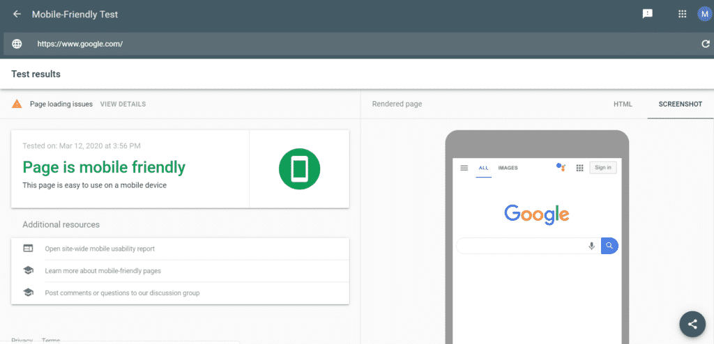
- In order to get more information from this point simply click on the get more details link in the top left corner. This will tell you exactly what went wrong and where it went wrong. Look for any broken pages, images or links as these will all greatly affect user experience.
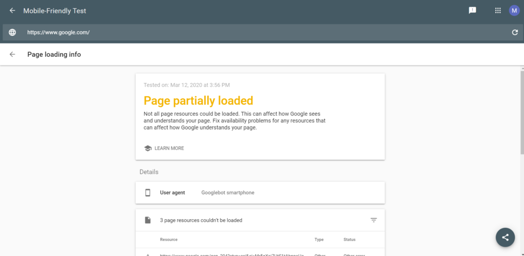
- If you do have many page errors the next step will be to look into fixing them. This process could vary greatly depending on what platform your website is built on and many other details
For more information about how to optimize your page to work with mobile devices click here to see a guide from Google. If you would like any additional help with your website you can also contact us here.